
THIS WEEKS THEME: Mermaid themed book covers!

FORGIVE MY FINS (Fins #1) by Tera Lynn Childs
One thing that is going to be standard on all Mermaid/Sea Creature covers, is blue and green coloring. Almost every cover I see has those two colors in some form or context. This one seems to have added a filter that gives the model a bluish-green tint, and then her eye shadow and lipstick tie in these hues as well. I think the font used for the title is great, and lends a girlishness to it, as well as keeping with the flowy, watery theme just like the white-dot waves that surround the title and authors name. I always like when the title is bold and really stands out, and giving the author's name a standard, simple font allows that to happen.
The title is placed well, in contrast with the model's face which dominates the upper cover. I'm curious about the blue "breath" it looks like the model is either inhaling or exhaling... I do own this book, but haven't read it yet. Now I'm getting curious! It also makes me want to try out a "mermaid-y" makeup look... hmmm, future post, maybe? FINAL SCORE: 3.50/5.00
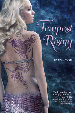
TEMPEST RISING (Tempest #1) by Tracy Deebs
Another one that I own but haven't read, I must say part of the appeal of this one, is that gorgeous cover! Plus, Tera Lynn Childs does say that it's "Dark, magical, and achingly beautiful." How can you ignore that?!
What I really love on this cover is the contrast between the dark watery background and the model's pale skin and wavy blond hair. The shimmery iridescence of her tail scales and that awesome purple back tattoo really draw me in. It's also pleasing to the eye because the background has some purplish-blues in it, so to me it really ties the two elements of the cover together.
This one also appears to be well balanced, with the flowy title font, author's name in a more simple font, and then the recommendation at the bottom work well opposite the model. It lets the boldness of the tattoo and tail really stand out and come at the reader, while remaining more demurely on the side. FINAL SCORE: 4.50/5.00

RIPPLE by Mandy Hubbard
This one I have read, and while it was a good story, it wasn't the best mermaid book that I've read. I like the cover on this one for the fact that it's different than most. Instead of blatantly showing you that there is a mermaid involved (which I didn't know until I read the jacket) they decided to incorporate a few of the themes from the book to give you the mermaid-y impression.
First, the water. I love the water! So shimmery, and blue and green and the light from the moon reflecting off of it! And the way the tree splits the cover in half without really drawing from its appeal gives the sky it's place on the cover as well. Having the female model in a flowy green dress that almost matches the water color gives the illusion that there's some type of relationship between them. And then the swirly tattoo crawling up her calf also gives us an idea that she's not just a boring old human!
I like that they did the placement of the author's name and title and then a little blurb at the bottom the way that they did. This layout really works, especially with the title going vertically. Because there is so much going on nearly the entire length of the cover, placing the title horizontally, in my opinion, really would've drawn away from the attractiveness of it. The simple font works well on this cover too, as anything more scroll-y or fancy wouldn't have worked. FINAL SCORE: 3.50/5.00

SIREN (Siren #1) by Tricia Rayburn
OH! Did I love, love, love this book! I definitely buy books for their pretty covers, and this one was no exception!
I love when a book that is a little darker, or not as light and airy convey that on the covers. With this one having a dark almost sepia tone to it, it's clear that it won't be a fun, fanciful tale. I love how the water is rough and wavy, these dark rocks are just jutting up from the surface with three figures standing on them. It's so mysterious! It immediately makes you want to read it to find out why there are there - and what they are doing!
I like the 3D-ness of the title, created by using shading and highlighting. It makes it pop from the clouds, and doesn't look static as to distinguish it from the rest of the cover. The author's name in white also give it a pop of color and looks better than I think it would had they used black. It would've drawn from the title as well. FINAL SCORE: 4.50/5.00
Have a suggestion for a cover theme? Let me know in the comments!
Happy Reading!


No comments:
Post a Comment
Leave Me Some Love :))