
Hey Bookworms! This is a new meme that I've created, to combine my love of books with my love of art. These posts will focus on cover art only, and unless stated, I haven't read them yet. Enjoy :)
THIS WEEKS THEME: Yellow & Orange Covers
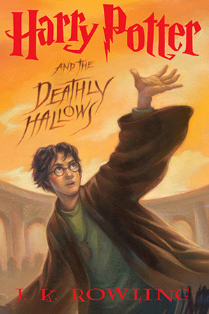
HARRY POTTER and the DEATHLY HOLLOWS
[Harry Potter #7] by J.K. Rowling
Ah, one of my favorite and most beloved book series ever! YES, I have most definitely read this one! What I love about the covers of the books in this series, is their simplicity. Which is so misleading, considering the content within those pages.
For me, this one was probably the one that isn't amazing. It's just OK. I do love the way all of the colors have the same undertones so they blend well together, and nothing sticks out oddly. There's not too much to talk about on this one - It's got the same Harry Potter font as all other books, movies, etc. and the author's name is in the same font as previous books too. I do like how they wrote, "and the Deathly Hallows" though, makes me think of the Death Eaters!
FINAL SCORE: 3.00/5.00

THE CHRONICLES of NARNIA [Books #1-7] by C.S. Lewis
I believe this is the edition that I have, all of the books in one giant volume, so this is not and does not include the original covers. I think I'm a little partial to this cover, considering I adore Aslan, and being a Leo, I do love me some lions... *roar*!
This one has a lot going on within the flame/glowing mane of Aslan, and I think it's very intricate and beautiful. The use of a simple font works great at the top of the cover, considering there is so much going on it wouldn't work if there was a very fancy, over-the-top type font.
FINAL SCORE: 4.50/5.00

CITY of FALLEN ANGELS [The Mortal Instruments #4] by Cassandra Clare
First off, I REALLY need to read this series. Second, I think they have some of the most visually striking covers out of any of the series out there. They all follow the same layout, image at the top, title, series, and author name at the bottom. I also like that they clearly mark which book in the series it is.This one is fiery, and bright, and usually I don't like when a model's face is cut off, but this one actually works because it adds an air of mystery to the male character. I don't like where they cropped the female model's head though, I think it's kind of awkward and should've just included her entire head.
There is a lot going on behind the title placement too, which is pretty cool! It's showing a view of the city, and then a very wispy, flame like "sky" tops it off to blend up into the models with a bright gold background. I really love the colors they chose and how well they all play off each other.
FINAL SCORE: 4.50/5.00

DEMONGLASS [Hex Hall #2] by Rachel Hawkins
Another series I need to read (I do own book #1)... I always enjoyed the covers on the books in this series. I enjoy the way they play off each other as a "good/bad" scenario.
It's awesome that they not only reflect the model in the pool of "fire", but they also mirrored the title and author's name. I just love it! Everything is working so well together, and the shade of gray that was chosen blends well into the white "edge" of the fire pool, and that then blends well into the flames.
I also like how the flames on the edges are a thicker, darker red-orange and the area around the model creates a yellow-gold "aura". The white of her dress really pops too.
FINAL SCORE: 4.50/5.00

COEXIST [Keegan's Chronicles #1] by Julia Crane
I actually just recently downloaded this one on my Kobo thanks to BookBub for alerting me to it! This isn't the cover on the edition that I have, but I do like this one too, and it works for this post!
Can we just talk about the vines growing up her legs?! I LOVE that! I think it really grounds the character and brings the magical world into the cover without giving anything away. The glowing aura behind her kind of reminds me of a doorway or gateway to a magical world, and the little butterflies around her make me think of fairies!
It gives the idea of a magical place in the middle of the city (maybe like Central Park) where things happen that nobody ever considers or thinks exists.
I really like the font used for the title, and the color but I don't think it really fits with the cover's colors. I might have gone for a more neutral, earthly shade of green with a golden backlight. I do like the series placement below it almost like the title is underlined, and the simple font for the author name at the bottom in white works well.
FINAL SCORE: 4.00/5.00
Happy Reading!


No comments:
Post a Comment
Leave Me Some Love :))