
Hey Bookworms! This is a new weekly meme that I've created to combine my love of books with my love of art. These posts will focus on cover art only. Enjoy!
THIS WEEK'S THEME: Urban Fantasy Covers
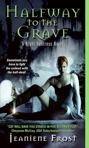
Halfway to the Grave [Night Huntress #1] by Jeaniene Frost
I actually have no idea what this series is about, but I'm pretty darn curious after really looking at this cover and all it has going on. First off, the sword in her hand that is glowing? Uh, yeah, you go Ms. Badass! Not to mention the thigh-high boots and the black dress? Yeah, this girl doesn't take crap from anyone!
I love the spookiness created by the moonlight and the trees in the background. Keeping this one very monochromatic in blacks, whites, and grays works great, especially with letting the models shock of red hair bring the only color in (besides the little sword glow).
There is a lot of writing going on on this cover, which I think makes it a little too cluttered. I like the green color pulled in by the title and quip from USA Today, and I really like the font used for the title and author's name. I think it just has a little too much going on, but keeps a decent balance. I would've skipped the USA Today quote, and just stuck with the quip on the left side of the model. Overall, I think this is a great paranormal book cover. SCORE: 4.25/5.00
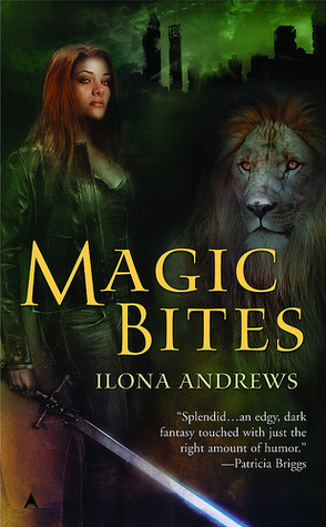
Magic Bites [Kate Daniels #1] by Ilona Andrews
I've seen this series at the bookstore and it's one that always interested me, but I don't know if it's necessarily the cover that draws me in, or just the fact that it has 'magic' in the title!
So there's a lion on the cover, which is awesome! I adore lions, maybe because I'm a Leo, who knows, but there's a freaking lion! On the cover! Oh yeah, and a pretty intense looking chick with a crazy sword! I really love the glowing emerald sky/skyline in the background...it really makes me wonder what this one is about.
I don't necessarily care for this cover, though. It seems photoshopped, and like a lot of time wasn't spent on it. I don't think the colors used blend well together, and I don't like where the title, author, and blurb are put; and all in different colors. It just seems like one I wouldn't pick up just for the cover alone. SCORE: 2.00/5.00

The Lightning Thief [Percy Jackson and the Olympians #1] by Rick Riordan
Less is more. That is exactly what this cover portrays. It is very simple and basic, yet relays what the book is about while keeping a very monochromatic palette and keeping it very minimally cluttered with the title, author name, and the series name/book number.
I really like this cover. I think it's self explanatory, and what you see is what you get with this one. The colors all work wonderfully, I like the shade of yellow used for the title, and the simple, white font for the author's name. I really enjoy how the series name and book one are written on the side too. There isn't too much going on that your eye is being pulled in all different directions, but there is enough to get the gist of what it's about. SCORE: 4.00/5.00
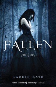
FALLEN [Fallen #1] by Lauren Kate
I have always adored the cover for this book, and I won't lie, it's why I bought it! It's so beautiful and gothic and melancholy. I adore everything about this cover: the colors, the dress! Oh, that dress! The font used for the title is great, and the spooky, creepy birds flying in the background add an air of eeriness. There is nothing that I don't like about it, really! SCORE: 5.00/5.00
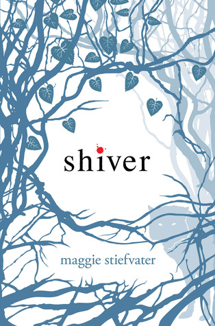
Shiver [The Wolves of Mercy Falls #1] by Maggie Stiefvater
This one drew me in immediately. I really like the cover, and my favorite part is the wolf. This is another cover that is so simple yet I find it more appealing that one that is full of color and has a lot going on. Keeping the range of colors to a minimum and only having the title (which I love how it's right in the center of the cover) and authors name in the branches is great. SCORE: 5.00/5.00
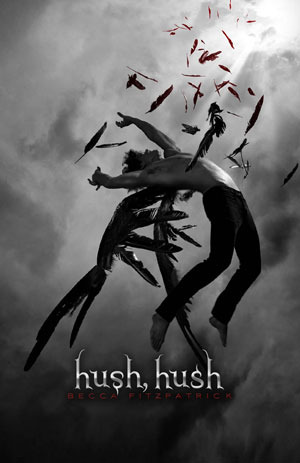
Hush, Hush [Hush, Hush #1] by Becca Fitzpatrick
Another awesome cover! I love covers that are just black, white, and gray and how can you walk past a book with an angel like that taking up the cover?! I love the feathers everywhere and how it looks like he is "Falling" and the way it's a smidge lighter all around him. And the font used for the title is awesome. The tiny hints of red work great too, and tie in with the red of the author's name. SCORE: 5.00/5.00
Happy Reading!


I loved this post of yours ! I mean we all have different reasons for buying a book but one of the primary reasons would be the cover. Even if we don't like to mention this fact, subconsciously its the cover that makes us pick the book from the shelves in the first place ! I too have loved Fallen and Hush Hush covers. Hush Hush series was awesome but Fallen was quite a disappointment for me!
ReplyDeleteIs there a way I can participate in this cover madness fun??