Hey Bookworms! This is a new weekly meme that I've created to combine my love of books with my love of art. These posts will focus on cover art only. Enjoy!
NOTE: Last week a follower commented on whether there was a way to participate in this meme. If you are a blogger and you are interested in posting I Love Your Cover posts on your blog, please comment below or email me. I'd be happy to set up a linky to link your posts up, as well as come up with a list of topics for the future. If you are a follower and want to suggest covers or topics, comment or email me! I'll make sure you get credit in the post.
Pushing the Limits [Pushing the Limits #1] by Katie McGarry
Okay, this one I have definitely read, and gave it a coveted 5-Star Rating (which means yes, if you haven't read it yet... you need to go do that. Like, now.) This is one intense book, and I love the fact that I get that same vibe from the cover. It's not too lovey-dovey, and it doesn't suffer from 'Let's rip each other's clothes off and practically do the dirty on the cover' like I see a lot of the New Adult book covers showing. This one keeps it clean, but still lets you know something cray-cray is going down between these two lovebirds!
Like I've been mentioning in a few past I Love Your Cover's, I really dig it when covers use a limited palette of just a few colors. With Contemporaries you don't really need insane, crazy colors or an air of mystery like with paranormals or fantasies. Contemporaries can be anything they like - whimsical, plain, over-the-top... there's a freedom that I think isn't available to every genre out there. This one takes the plain, simple approach which is so misleading with what is between those covers! I don't think it's a great cover, but it's not horrible by any means. FINAL SCORE: 2.50/5.00

Anna and the French Kiss [Anna and the French Kiss #1] by Stephanie Perkins
And yet another one that I've actually read... considering Contemporary is my least-read genre. I actually picked this one up because of the cover. I adore books set in Paris, or really in France in general. I don't know why, but I do. And what I like about contemporaries set in other countries, is that it's a refreshing change from what we know as everyday life.
So the first thing that pulled me in, is the Eiffel Tower. I love that it's center of the cover, but blurred just enough to bring your eye too it, but not keep it there too long. As soon as I see that, my eye then goes to "Anna" and then to her hand and the "Mystery Boy's" hand.
I really like the placement of the title, and adore the font that was used! The green matching the grass ties the two together, and then the author's name at the bottom in white works wonderfully! This cover is also more simple, and not overly crowded and there aren't too many things that our eye wants to try and take in. By keeping it simple, we are able to get a quick idea of what the book will be about, and I think that is great. FINAL SCORE: 5.00/5.00
Perfect Chemistry [Perfect Chemistry #1] by Simone Elkeles
Finally, one I haven't read! This series has high ratings on Goodreads and I've been meaning to read them... but just haven't gotten around to it yet. Another contemporary taking the plain, simple route with cover design.
This one is nice, in that it really makes us focus on the couple on the cover. There is an incredibly intense connection between these two (I assume Brittany & Alex from what the summary on GR says!) and it kind of makes me want to go get the book from the library immediately!
I love how the only colors used in the background are black, some gray, and then the "blurred" title in white, and the author's name in red tie in with the simple black and white shirts of the models. Keeping it all the same colors really makes it uniformed and balanced, and lets up keep guessing on the relationship and lives of the couple. FINAL SCORE: 3.00/5.00
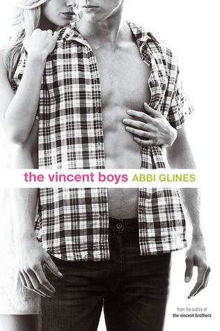
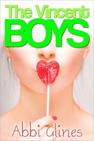
The Vincent Boys [The Vincent Boys #1] by Abbi Glines
There are two covers out there for this one, and I am going to review them both. I own a copy of this book (but have not yet read it), and the one I own is the first one that I'll talk about.
This cover is the paperback release cover, which came out in October of 2012. It is definitely different than it's hardcover companion, but I don't know if I'd necessarily say it's better or worse. In my opinion, the models seem a bit too old for the characters in the book that they are supposed to be representing. I would go more with New Adult than Young Adult for this one, based on the cover alone and not what it is actually about. I get a very "physical" vibe from the cover, and would assume that it's got more sexual content than a YA book would.
Again, this cover follows the previous ones with a subdued cover; black and white for the background, and a pop of pink for the title, and green for the author's name on a white background front and center. Overall, it's not an awful cover, but I feel like it could have more to it. Even though I did buy it, more from seeing it around on blogs, I don't think the cover alone would pull me in and purchase it. FINAL SCORE: 2.50/5.00
The hardcover version has more color than it's paperback partner, but I don't think this one is necessarily all that great either. While this one uses more color, which definitely draws my eye to it more than the black and white of the paperback, where the paperback seems more New Adult, this one definitely carries a more YA vibe. I love the bold green color of the title, while it uses a simple font offset by the more script-y author's name in pink at the bottom. I don't like how big the title is, and how small the author's name is. It doesn't feel balanced to me, and I'd have stretched the author's name so that it lined up more with the edges of the title.
The heart-shaped sucker gives off a few different vibes - youth, and maybe because I read and loved Beautiful Creatures, I get a "Bad ass" vibe from it, like with Ridley. So I get a vibe of a girl who is one person, but wants to change into another person. The way the top is white and blurred around where the model's head is, and the title is, I feel like that is almost "erasing" who she is, so she can become who she wants to be. FINAL SCORE: 2.50/5.00

The Fault in Our Stars by John Green
*2012 Goodreads choice winner*
I need to read this one. No, let me change that statement. I need to read John Green. Everyone seems to absolutely love every one of his books, and I don't think I've ever seen or heard or read anything negative about them at all! I actually, really like this cover. The "chalkboard" font effect is really cool, and I love the shade of blue behind the black and white clouds; and the alternating font color [i.e.: black cloud white font; white cloud black font] is cool. It's also great that for once the title and author's names are the same size, and take up the whole center of the cover. I like that!
I also love how they added the little blurb from Jodi Picoult at the top, balanced out by the quip at the bottom about 'NY Times...'.
From looking at the cover, and knowing just a tiny bit of what it's about, I get a vibe that it will be a sad but happy book. I associate the black cloud with the harder, more emotional content and the white cloud with the happy, lighter notes. I know that I've definitely picked this one up just because of the cover alone, but never actually purchased it. For me, cancer is a very touchy subject, having lost my brother, and an aunt that I was very close to, as well as my grandfather to the disease. At this point, the only book that deals with cancer that I actually did read is The Probability of Miracles. I need to not base my book selections on personal issues, because I think if I didn't read this one, I would really be missing out on an incredible book - especially having gotten such killer reviews and having won the Goodreads Choice award! FINAL SCORE: 4.00/5.00
My Life Next Door by Huntley Fitzpatrick
Wow, another one that I've actually read! 2012 was the year of Contemps for me, I guess! I absolutely adored this book too - and the cover is just one of the amazing reasons why this book rocked my world!
The couple on this cover are cute, not very intense, not incredibly all over each other - and actually, I feel a little awkwardness from them - which makes sense if you've read this one!
I love the fence, which represents the separation of Jase and Samantha's yards, and lives as well. But that they are together on one side of it - represents their willingness and ability to do anything to be together!
The flowers at the top add a nice vibe to the cover, and the "sun glare" effect is nice too. I like the yellow of the dress matching the the simple, yellow font of the title that your eye is pulled towards. I like that the author's name seems to be almost a balancing platform for the title, and that it works wonderfully with the rest of the cover.
All of the colors used have similar shades and undertones (like the 'Jase' model's shirt matching the author's name color) so that they all work well together, and nothing seems to stick out in a bad way. FINAL SCORE: 4.50/5.00
Happy Reading!


I am very new to blogging and have been looking for some awesome meme's to participate in and then I find your post! I would love to participate in 'I Love Your Cover' ! Lemme know when I can put the post up and email you it's link!
ReplyDeletesshah605 at gmail dot com
- Gayatri @ Notorious Writer.