
Hey Bookworms! This is a new weekly meme that I've created to combine my love of books with my love of art. These posts will focus on cover art only.
If you would like to participate in future I LOVE YOUR COVER posts, please check out the 'I Love Your Cover' page at the top of the blog for a list of future topics (Coming soon!), and link your posts up at the end of this post. If you have any suggestions for future topics or covers, please comment below, and you will get credit in the post.
THIS WEEK'S THEME: Oh la-la-lavender Covers
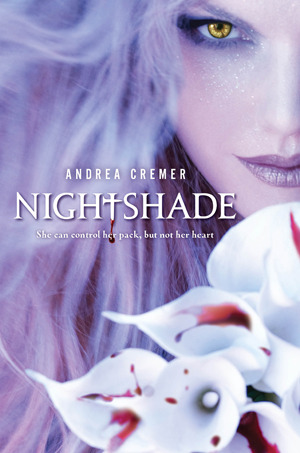
NIGHTSHADE (Nightshade #1) by Andrea Cremer
I actually purchased this book for two reasons; the first being the cover, the second being uh, hello, werewolves! This cover is so gorgeous, and even more so in person because it has this shimmery iridescence to it. I absolutely adore everything about it - especially the makeup and the model's eye color. I think the placement of the title with the author's name and the little blurb are placed perfectly, and I love the calla lilies on the cover (I do know the main character's name is Calla so that's cool!) and the blood on them makes me want to read it to find out why! And I also would love to try that shade of lipstick out, for sure! Even her eyebrows have been made purple. Did I mention that I love the color purple? Absolutely LOVE this cover! Final score: 5.00/5.00
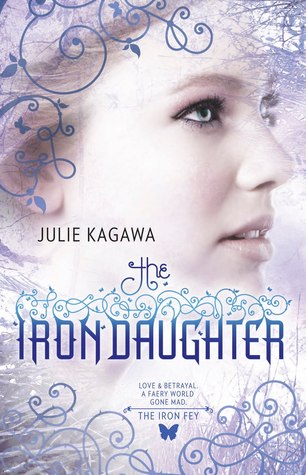
THE IRON DAUGHTER (The Iron Fey #2) by Julie Kagawa
I have only read book one in this series (why?! Why have I not finished the series with how amazing the first one was?!) but I always loved the covers on all of the books. I love how this one appears almost "frosty" looking. I love the butterfly that adorns each cover where it says, "The Iron Fey" with the little blurb above. I love all of the scroll work on the cover, and the profile of the model gives it a different vibe than a front-facing photo.
I also like the different shades of purple used, as well as the fading of the darker blue and icy blue colors that work wonderfully with the other colors used. The hint of tree branches in the top right corner is unique too. Final Score: 4.00/5.00
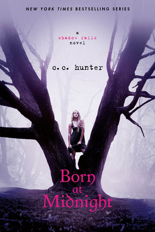 BORN AT MIDNIGHT (Shadow Falls #1) by C.C. Hunter
I have the ebook of this one, but haven't yet read it. I originally saw this one at my library, and really liked the cover. My two favorite colors are pink and purple, so both are on this cover - of course I like it! Plus, I love trees and the V-shaped one is no exception... plus it's creepy with the mist all around, and a bad-ass looking chick in the middle!
The font used for the title is nice, simple but with it's own personal flair. I think the placement of the title, series name, and author's name work well too, and I like the "Typewriter" font used too. Over all, I really like the colors on this one, and the creepiness. It really makes me want to read it! Final Score: 4.00/5.00
Sorry this is a short week... I will probably do this topic again because there are so many more beautiful lavender covers out there!
Keep Calm & Read On!
Laura
I have only read book one in this series (why?! Why have I not finished the series with how amazing the first one was?!) but I always loved the covers on all of the books. I love how this one appears almost "frosty" looking. I love the butterfly that adorns each cover where it says, "The Iron Fey" with the little blurb above. I love all of the scroll work on the cover, and the profile of the model gives it a different vibe than a front-facing photo.
I also like the different shades of purple used, as well as the fading of the darker blue and icy blue colors that work wonderfully with the other colors used. The hint of tree branches in the top right corner is unique too. Final Score: 4.00/5.00
I have the ebook of this one, but haven't yet read it. I originally saw this one at my library, and really liked the cover. My two favorite colors are pink and purple, so both are on this cover - of course I like it! Plus, I love trees and the V-shaped one is no exception... plus it's creepy with the mist all around, and a bad-ass looking chick in the middle!
The font used for the title is nice, simple but with it's own personal flair. I think the placement of the title, series name, and author's name work well too, and I like the "Typewriter" font used too. Over all, I really like the colors on this one, and the creepiness. It really makes me want to read it! Final Score: 4.00/5.00
Sorry this is a short week... I will probably do this topic again because there are so many more beautiful lavender covers out there!
Keep Calm & Read On!
Laura


No comments:
Post a Comment
Leave Me Some Love :))